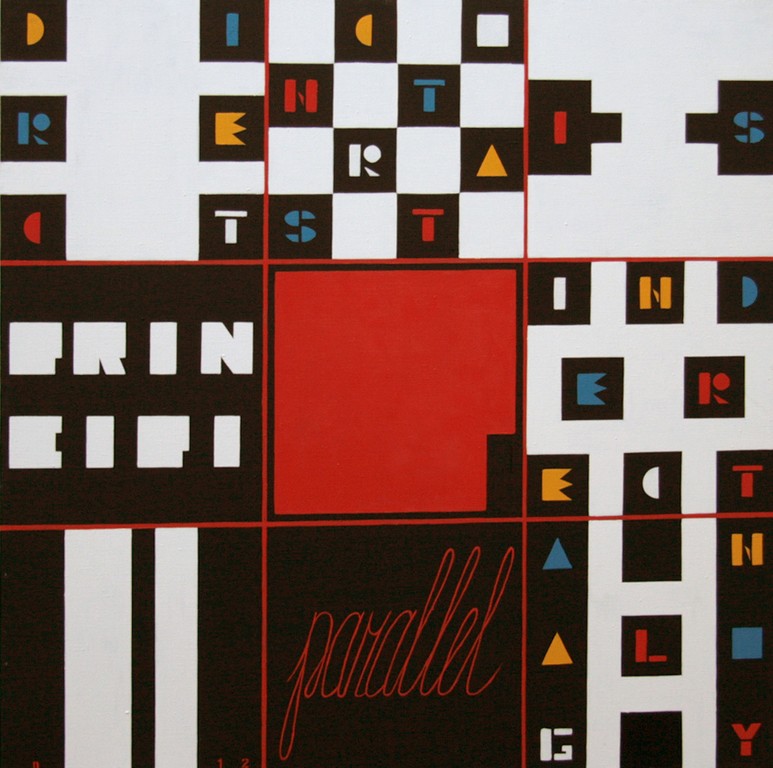
 Р. Parallel principi. Direct contrast is indirect analogy, 2012, canvas, oil, 100x100 cm
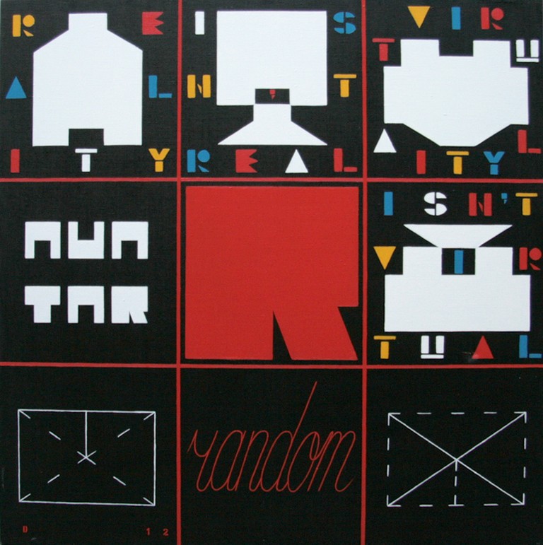 R. Random avatar. Reality isn`t real virtuality isn`t virtual, 2012, canvas, oil, 100x100 cm
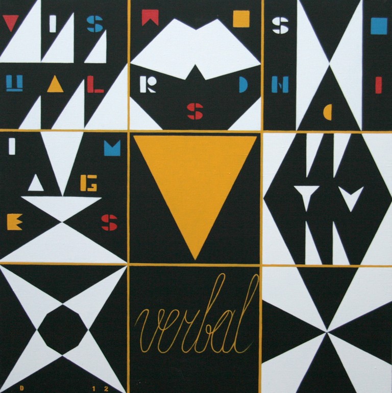 V. Verbal TV. Visual words sonic images, 2012, canvas, oil, 100x100 cm
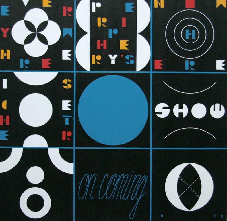 O. On-coming show. Center is everywhere periphery`s nowhere, 2012, canvas, oil, 100x100 cm
 U. Umpty you. A b c d e f g come on out and play with me, 2012, canvas, oil, 100x100 cm
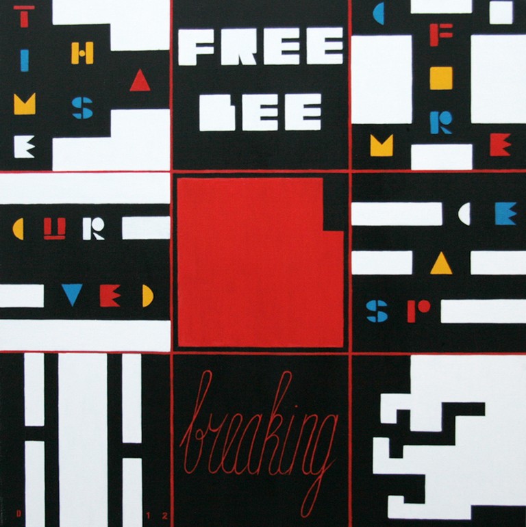 B. Breaking freebee. Time has come for curved space, 2012, canvas, oil, 100x100 cm
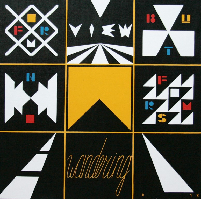 W. Wandering view. No form but forms, 2012, canvas, oil, 100x100 cm
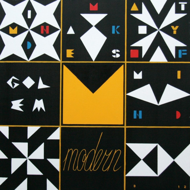 M. Modern golem. Mind makes a toy of mind, 2012, canvas, oil, 100x100 cm
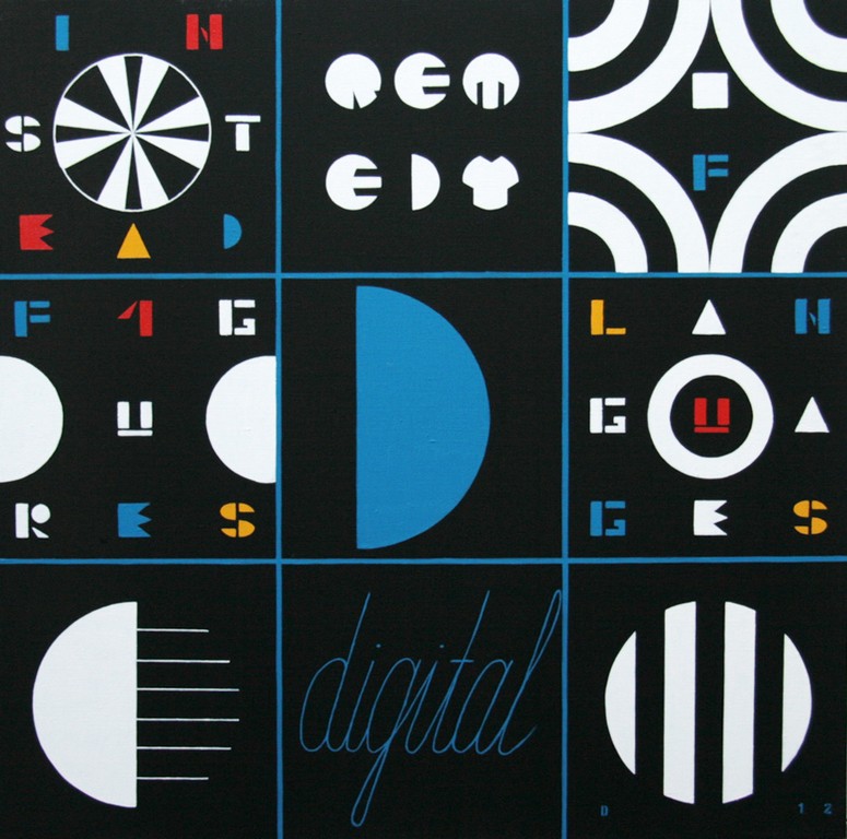 D. Digital remedy. Figures instead of letters, 2012, canvas, oil, 100x100 cm
 A. Ambient way. Find yourself outside and get extended, 2012, canvas, oil, 100x100 cm
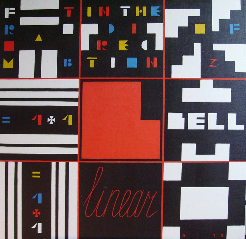 L. Linear bell. 1+1= =1+1 From A to B in the direction of Z, 2012, canvas, oil, 100x100 cm
Yaroslav Derkach
ALPHABET
13.07 - 31.08.2012
Alphabet – is an established order of communication signs that is described by standardization and ease of use. It influences the reasoning and generates dialogue, that automatically gain above mentioned qualities. Thoughts/words become one-dimensional and due to the simplicity of alphabet use they become even excessive and are infinitely replicated (thanks to Gutenberg). If one saw a dictatorship of air-tightness in the alphabet, one would will to reformat is somehow (within esthetical borders of course, proposing its dynamic model as means of communication that broadens our horizons). Thus, we get rid of the main features of literate/civilized communities, namely personal isolation, space and time infinity, uniformity of codes (thanks to McLuhan).
What concerns depiction of alphabet letters - they can be reduced to the simplest geometrical figures: triangle, square, round which correspond with the basic colors: yellow, red, dark blue. They are the symbols of alphabet, as a certain basis. A phrase/title – message of the picture begins with the letter which once ended is rhymed with the letter – the emphasis is on the phonetic stipulation of the alphabet. The text interprets and enlarges the meaning of phrase-title. Beside the text, the idea of a picture is conveyed in graphics with the help of geometrical compositions and drawings. The drawings seem to put a period to the text, together with pictorial components they are fitted into the grid which limits, fragments and simultaneously demands deconstruction.
The aim of such a project – creation of pictorial-textual multi-screen, where alphabet stops reducing sings to single space, thus generating its own. It is something like a technology of our self-enrichment.
Yaroslav Derkach
